CC3+ Geomorph Mapping

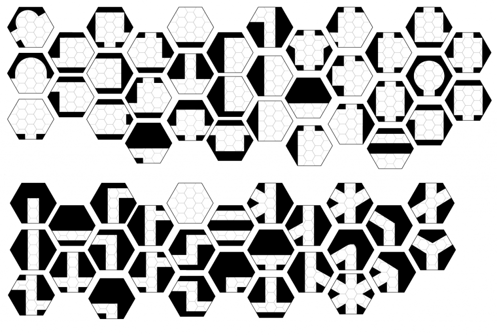
To take my mind off the day to day doldrum of work, home walk the dog, work, home walk the dog, and not being able to do much else I’ve started to get back into mapping with Profantay’s Campaign Cartographer 3+. I would like to be able to use all the Hex Geomorphs that I’ve designed along with some free style mapping that is not constrained within the seven or four hex boundaries (but still keeping them hex). The sheer number of outcomes for the Hex Geomorphs are staggering when you start to combine 3′, 6′, and 9′ passages and their connecting points on the face of the hex. So to help me organise a bit I started with the 6′ corridors using a style that mimics Ruins of the Undermountain which is one of my favourite Mega Dungeons of all time! I always liked the colour coded rooms of Core Room, Area of Interest, Teleport Area, etc.
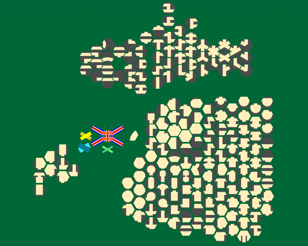
This is not even half of what will eventually be all the 6′ connections.
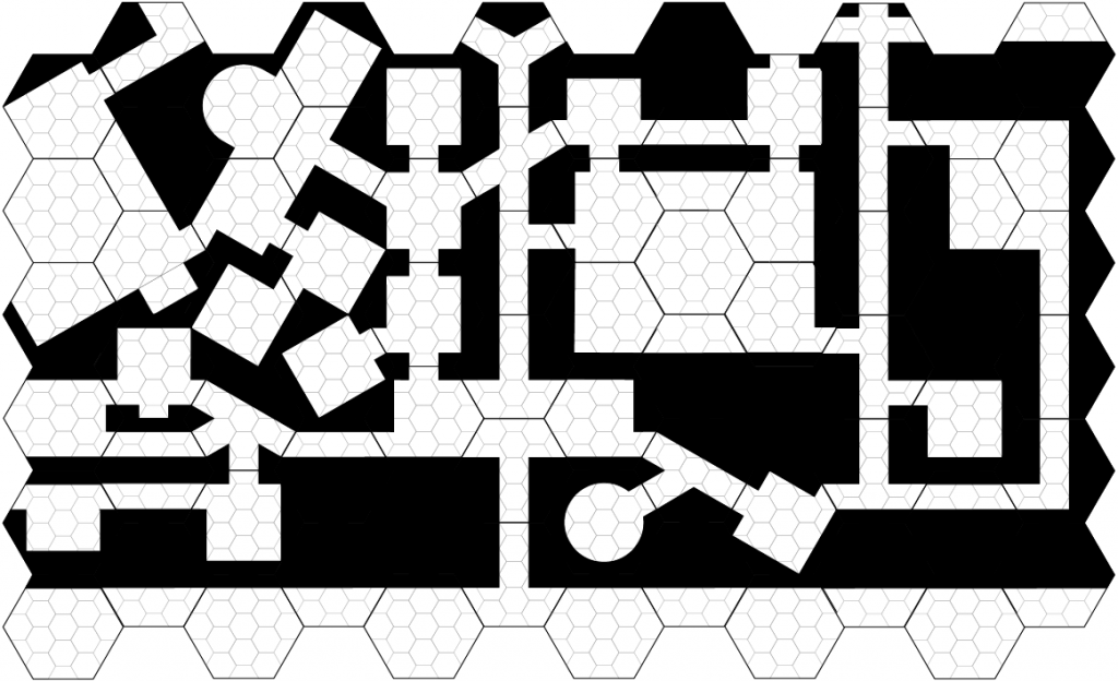
The dungeon is all Geomorph while the cave is freestyle. The picture below was made from Room 1 of this map.

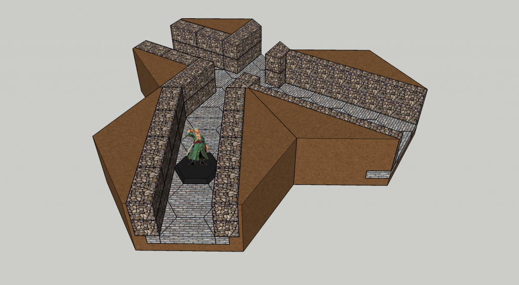
The great thing I find about using this old school style (is 1991 really old school?) is I can create them as symbols and just click, rotate, and place them where I want. Later when I have finished the set I can revisit it in a special saved version and then add walls. This way I will have Geomorph symbols in full texture that I can just place down and add dungeon dressing to later.
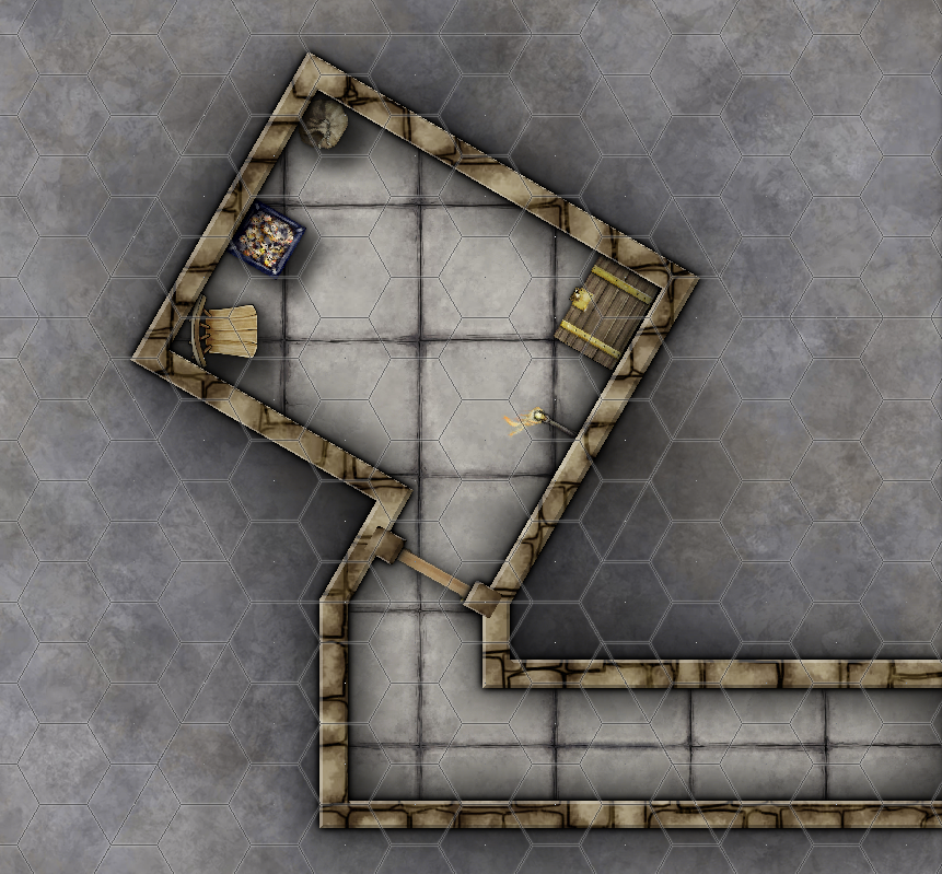
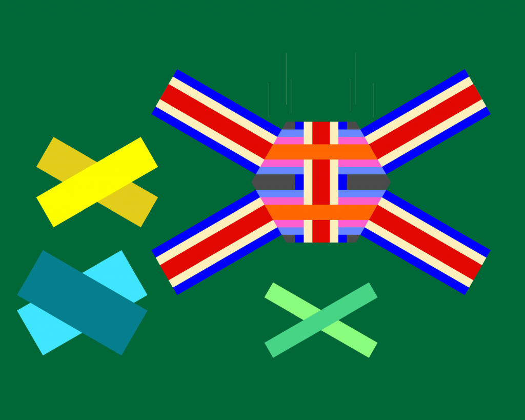
This dungeon room was transformed from Room #1 in the map above.
My template for making the 3′, 6′, and 9′ connections.

So I made three new layers called Template 3, Template 6, and Template 9 and froze them in CC3+. This way I can hide the layers I don’t need. As per usual the width of the horizontal corridors are slightly narrower than their vertical counterpart due to the 120° angle corners which makes the corridors interact at 30°

Single = 3′ with horizontal being roughly 2.61
Double = 6′ with horizontal being 5.21
Triple = 9′ With horizontal being roughly 7.8

There is no need to fill every bit of empty space

The map above was also made with a combination of free style and geomorphs. I would use this as a possible side encounter especially if I needed more time to finish the main scenario. Something like this can keep an adventure party busy and happy for an evening of gaming. Adding a series of portcullis down the 12′ corridor could give some tactical advantage/disadvantages and allow the thief like characters something to do.

I’ve been experimenting with different shapes of dungeons rather than the normal rectangular paper size.

Next is to create a new batch of symbols that adds more old school style of mapping.

Mini Magnetic Battle Tiles

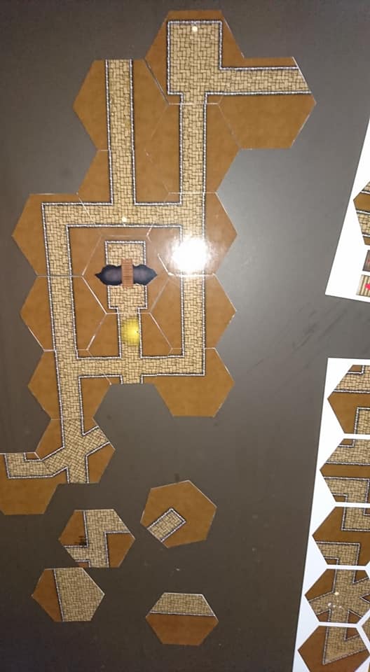
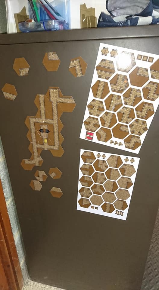
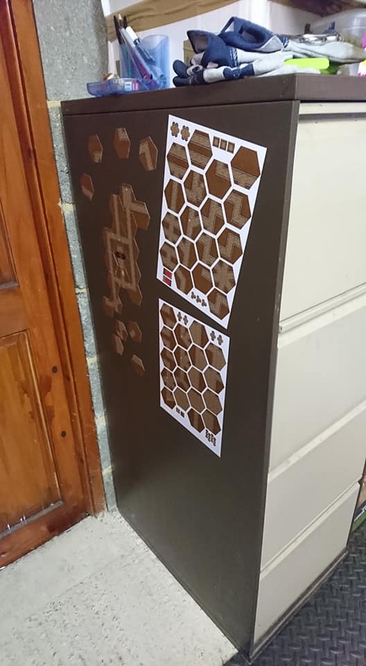
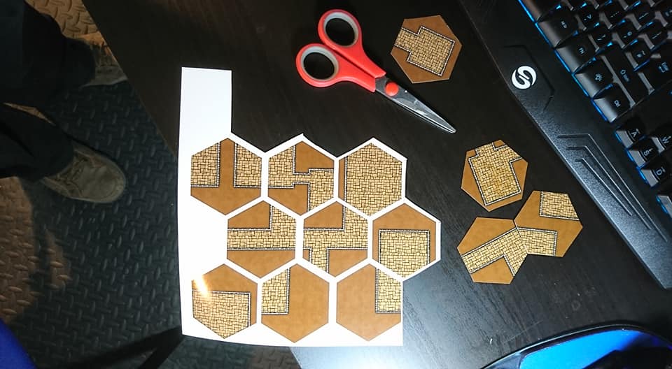
I found some A4 magnetic glossy sheets for inkjet printers. I wanted to see if i could print out the Battle Tiles at 2 inches vertical hexes. This way it can be a ‘mini map’ during play and I can pull out the appropriate 7 inch Battle Tiles during combat or special situations like trying to find traps and secret doors.

Testing them out on my metal filing cabinet.  I have a white board that we have used in the past for gaming and will be using that set on the table during play.

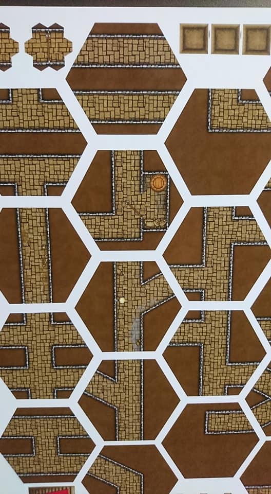
I am really pleased at the print quality that my Epson EcoTank ET-7750 was able to produce on these glossy magnetic sheets.  The stairs, doors, pits, and traps are a pain to cut out but they do stick to the top of the tiles allowing me to add features to the dungeon as well!

They cut better with a scissors then they did with the hobby knife. Now when we play I can place down the tiles as they explore the dungeons and they are just fun to play with on their own.

Swamp Adventures!

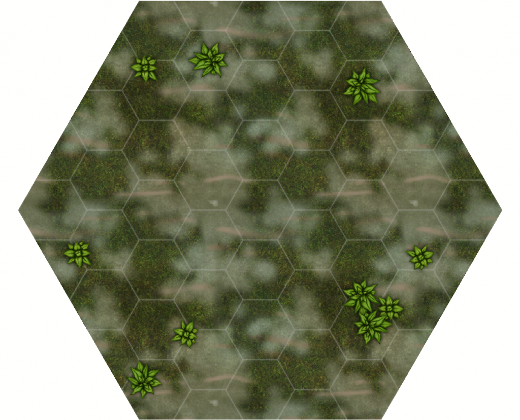
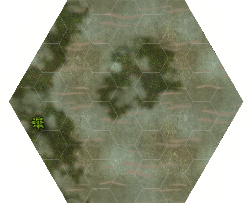
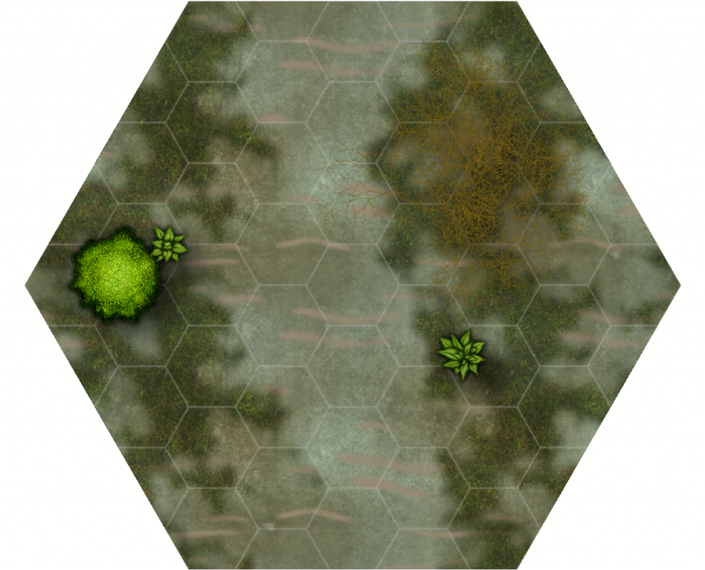
I’m working on a series of short encounters that can be strung together into a campaign.  Each encounter will include 3-7 Battle Tiles and possibly miniatures. The first part takes place in Lizard Man infested swamps.  I’ve still have some work to do on the layers and sheet effects but these first attempts should give a general idea of what they will look like.  Now for the lizard men.
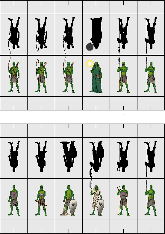
Made with Profantasy Software’s Character Artist 3

I’m hoping to get them printed on high quality gloss photo paper then mount them on 2mm greyboard so they will fit into the Black Hex Bases properly.  It is to bad that Character Artist does not provide the backs to the mini’s.

Battle Tile Tokens

To reduce the extremely large number of tiles I’m creating I’m adding tokens around the tiles.  It may use a bit more ink but it also allows you to get more out of your photo paper as well.  The tokens will allow you to place stairs, traps, treasure, etc. anywhere you want on your tiles.

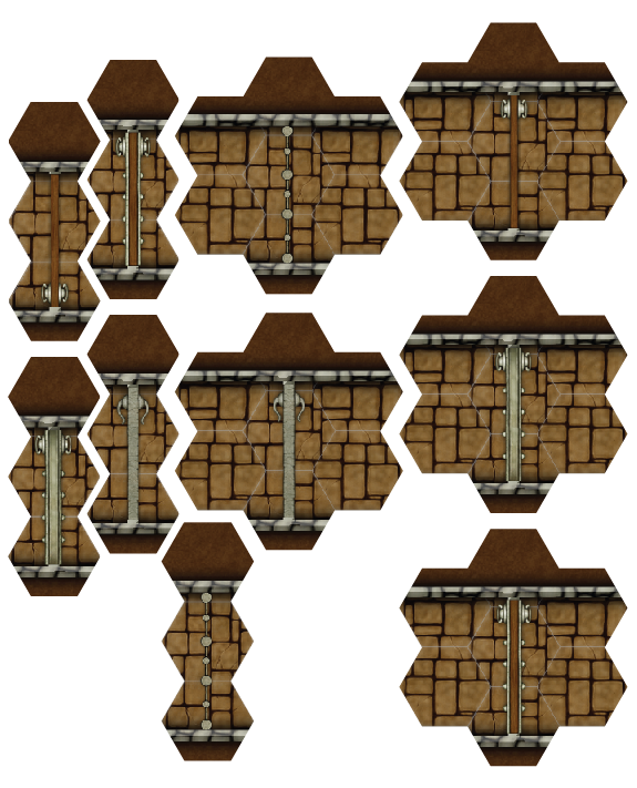
Door Tokens

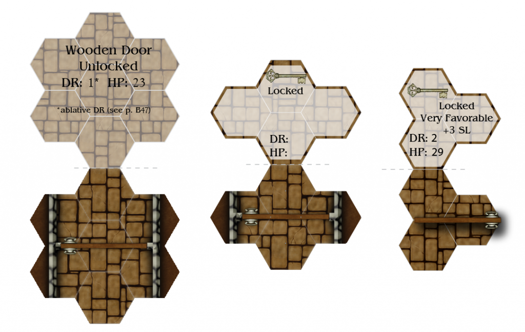
 These three style door tokens will allow you place your doors within any area on the tiles for the wider Vertical Corridors.  Carefully cut them out with a hobby knife using proper safety procedures and you can then either glue one side and fold in half on the grey dotted line or cut them in half and glue them on to thicker card. The backs of the tokens will have information on the type of door.  To make this easier and more customizable for those of you using the tiles all token pdf’s will be form fillable. Which means you can enter your own data. The center token in the picture above is how they will all look with blank data fields where as the other two is a representation of how they will look with the information inserted by the user.

Test it out on this pdf for yourself!  You will have to download the pdf, Google Docs won’t let you use the form features in the preview.

Because the Horizontal Corridors have to be slightly reduced in width I have created two types of door tokens for each door type. These also will have a form option on the reverse side.

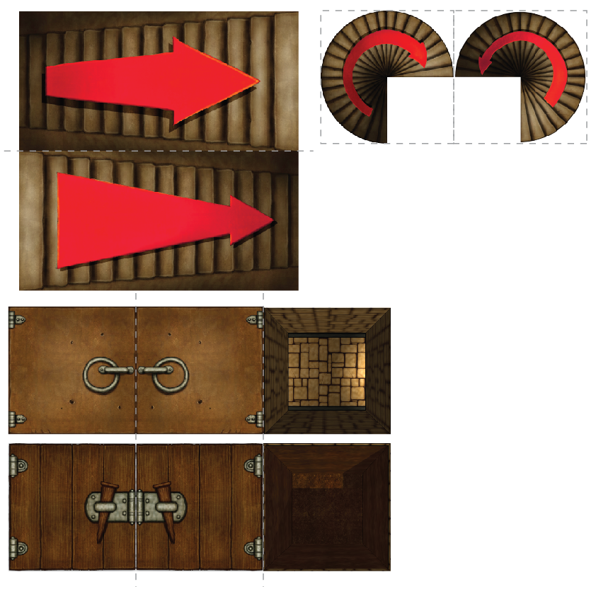
Here are some of the options you can place from getting from one level to another.  I manipulated the pit images in photoshop.  The top one is a pit down to another corridor directly below it and the bottom one is just a deep pit.  I probably should have placed a skeleton on the bottom for scale. If you fold the pit symbols on the grey lines and glue the trap door parts together then glue the bottom (pitt symbol) to a piece of thick card you can have a pit tile with a working door!

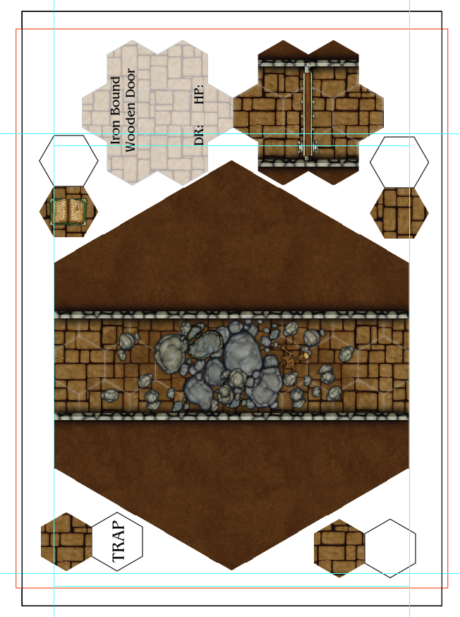
Now to make sure that the pdf’s can be used by both A4 and 8.5″x11″ I’ve placed a red rectangle on my sheet representing the size of 8.5″ by 11″. This will make sure none of the pieces will be cut off due to size. Everyone will have to print them with no margins though.

I’d be interested to know what kind of tokens people would like to see.

My Thoughts on 4″ Hex Tiles

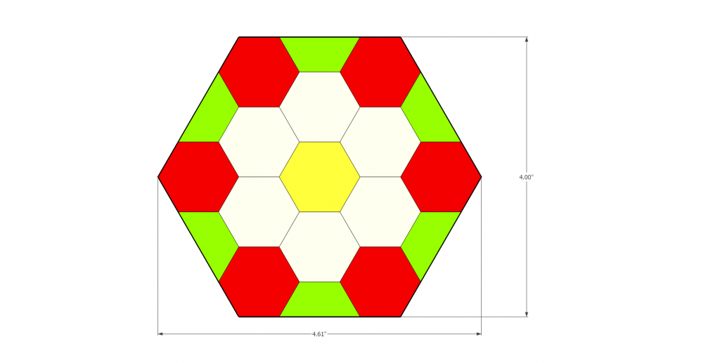
Last time I discussed, in my own disorganised way, my thoughts on 7″ hex tiles.  Now I’m going to delve into the 4″ hex tile.  As I’ve stated a few times before the thought first came to me when I saw the Tabletop Hex Terrain Toolkit on Kickstarter. This is going to be a great tool for making some wonderful terrain for both RPG’s and Wargames.  However the scale is just slightly off for my tastes (as discussed here).  I may eventually redesign the tool for use with proper one inch horizontal hexes, until then I am making four inch tiles to use for my GURPS Dungeon Fantasy games.

The 4″ Tiles can only support single and double width corridors (1 hex = 3′) compared to the three widths in the 7″ tiles.  Also the number of connections is reduced dramatically to the four examples in the following image, compared to the 9 images for 7″ tiles.

Corridor options

Although there are fewer options I don’t think the four inch tiles are inferior to the seven inch.  The four inch tiles will certainly allow for more dense dungeons, and with a bit of thought and planning will be able to offer some very complex designs. Also you can make any Hex Dungeon look just like any Square dungeon.  All it takes is manipulating the width of the horizontal corridors. If the corridors are the same width they will not match up when a horizontal corridor attaches to a vertical corridor.  The horizontal corridor will be too wide.

Both horizontal and vertical corridors are the same width, the horizontal is too wide

The horizontal corridor is now slightly smaller than the vertical. H: 3.43, V: 3.9

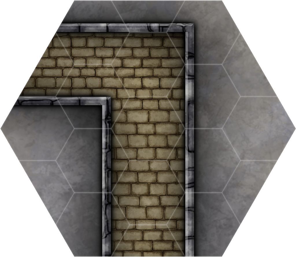
I can live with this slight alteration as it now gives me more options when designing.  I can now have corridors that turn at 90° just like you would with a square tiled dungeon.

90° left hand turn

Single width corridors and room tiles, just a fraction of the possibilities

An example of what can be made 1 hex = 3′ (1 meter)

What I like from the example above is how at any given time the orientation of the dungeon can turn 60° giving the dungeon a more natural feel.  If you’re digging a dungeon why would you limit yourself to a grid? Also once you add the double width corridors your increasing your options and complexity.  I’ll be adding more as I have time.

I’ve got plans to make full 3D dungeons using the 4 inch tiles and plaster molds such as those you can get from Hirst Arts, Linka World, and 4bot Industries. The issue is I will have to make a lot of custom pieces and custom molds so I’m going to be shelving this project for the mean time.

I think switching from the 7″ to the 4″ tiles was the right choice for me. When I get time I will go ahead and place the 30+ 7″ colour tiles I’ve already made if anyone is interested in trying them out.  I’ll do the same for the 4″ but not until I get a large amount ready.

Pro

  • You can make dense dungeons without so many extra tiles
  • Easier to store
  • Can produce more random results
  • Easier to use “Fog of War” effect

Con

  • Only single and double wide corridors, no triple
  • No irregular/offset corridors
  • Floor textures may not align properly
  • Custom 3D parts

Profantasy Software

Mapping with Master Hexes

Hexomorfo System

Hirst Arts

4bot Industries

2010 & 2011 Cartographer’s Annual

I just purchased the 2010 & 2011 Cartographer’s Annual from Profantasy Software.  I’m most looking forward to 2010 March issue which is Dungeon Geomorphs and 2011 February and June issues which also deals with dungeons.   The 2011 August issue is vertical geomorphs which I will be exploring first to give a sense of depth to this crazy Megadungeon.

I hope to post more pictures soon.